
Core product Re-architecture
Thirdfort - Product Design - SaaS - 2024→2025
Overview
Thirdfort is a UK-focused client due diligence platform combining automated ID verification, AML screening, ongoing monitoring, and Source of Funds checks into one client-facing app journey. The company’s mission is “to protect society from fraud and money laundering,” and their strategic advantage in a field awash with competitors, is their top-quality customer service team, and their intuitive UX design built around user workflows.
Source of Funds—one of Thirdfort's core products—is sold to solicitors and estate agents who use it to confirm a client genuinely has the money in place before a life-changing transaction like buying a home.
Media
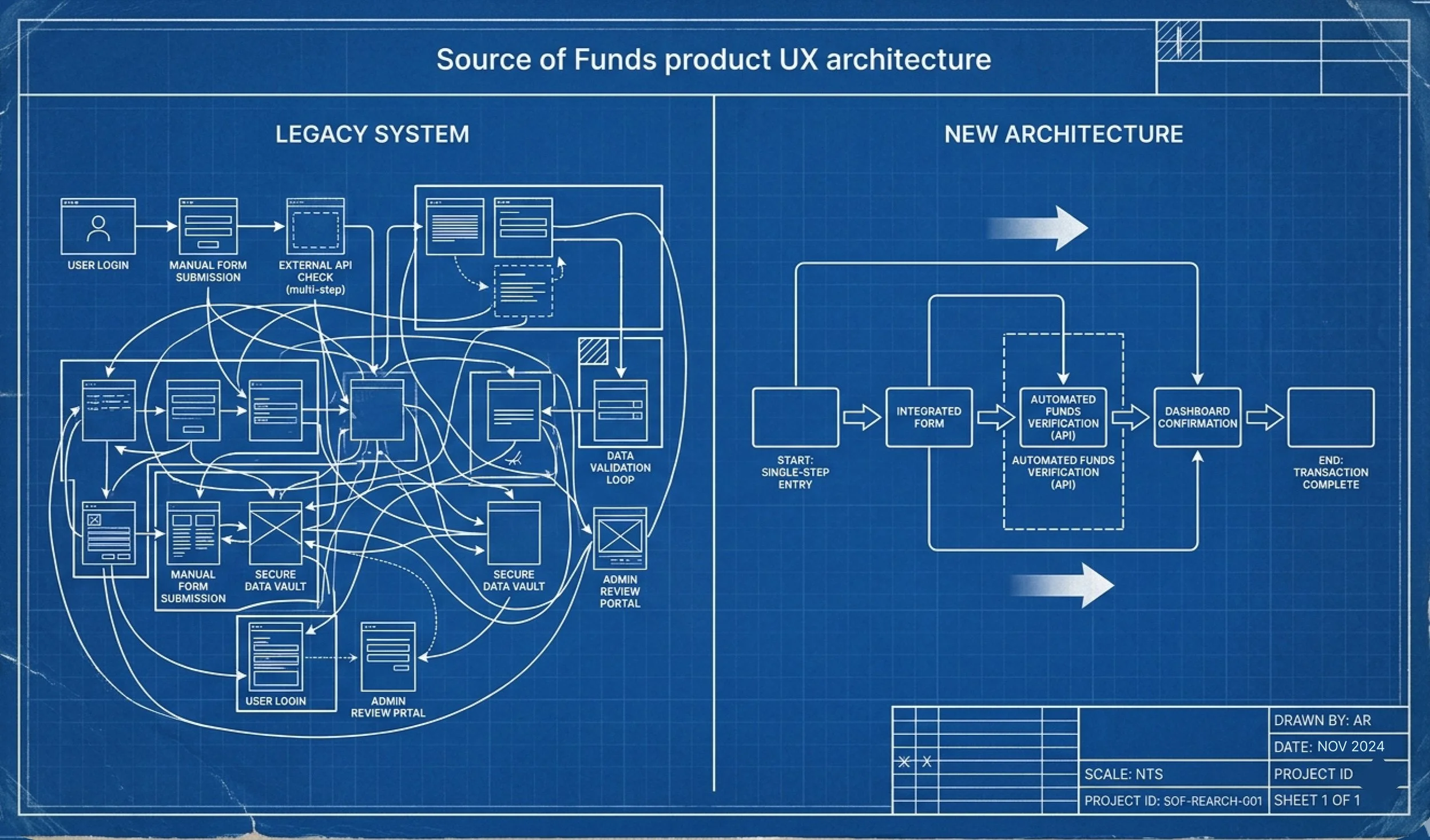
Redesign of product architecture, affecting company apps, and back end components. Documentation of rationale through text docs, wireframes, prototypes.
Team
Product Manager, SME in Compliance, Engineering team.
Project Scale
L
Problem
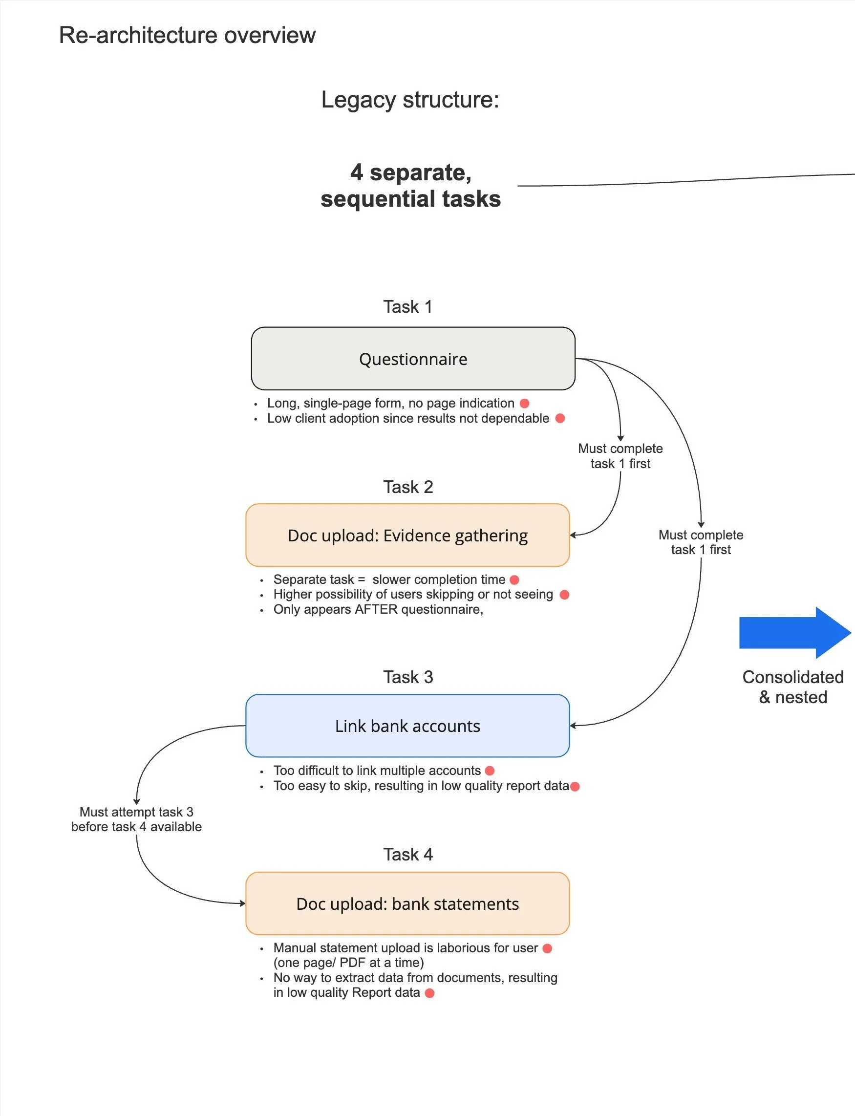
The legacy user journey was a long, multi-step process via an app, which was essentially one long form. The product was plagued with poor navigation and multiple places where users would get stuck, creating a frustrating experience and increased calls to the customer support team.
The product was a “one-size-fits-most” approach and was not flexible to meet different client or user’s needs. I led a first-principles rebuild, tackling scalability, configurability, and a backlog of known bugs.
Another big issue with how the product was built originally, is there was no ability for clients to customise the form based on their needs. For example, some firms want to see 24 months of bank statements, while others only require 6. The task was not built to be configurable, resulting in churning clients, and missed opportunities for the business.
Our goals
1. Product that is intuitive for users, measured by support burden per completed task
2. Environment that is intuitive for engineers, measured by reduced cycle + release time
3. Product that is configurable for clients, measured by enabled upsell into new sectors
Research
Working closely with the Consumer Support team, I drilled into problem areas; where and why users were getting stuck in our current journey, and how clients needs were not being met. Our legal expert SME and I worked with the client facing teams to assess what Thirdfort clients were really looking for, how their needs were unanswered, and used those insights to design the improved questionnaire. My team and I used the following methods to prioritise and categorise the improvements:
Client feedback and drop-off data told us bank linking was the highest leverage fix, so we sequenced there first.
Metrics on existing product, and quantitative support tickets showed users were getting stuck because they didn’t know how to prepare for each section, so I reorganised the tasks to provide users cues of what to expect.
Qualitative interviews with clients highlighted the pain points that were ultimately leading to churn: when the app failed to collect key user info like banking data and documents—so I ensured the improvements fixed those issues first.
Prototype walkthroughs provided rapid feedback from clients who knew the legacy system, to give us quick sense-checks as we made updates.
Card-sorting activities helped further prioritise work, creating understanding as to what trade-offs clients were willing to make when choosing a SoF provider: their “must haves” vs. “nice to haves.”
The signal across all of this was consistent: the problem wasn't what we were asking users, it was how the task was structured around them, which is what made an architectural rebuild, not simply a UI refresh, the right response.
Outcome Summary
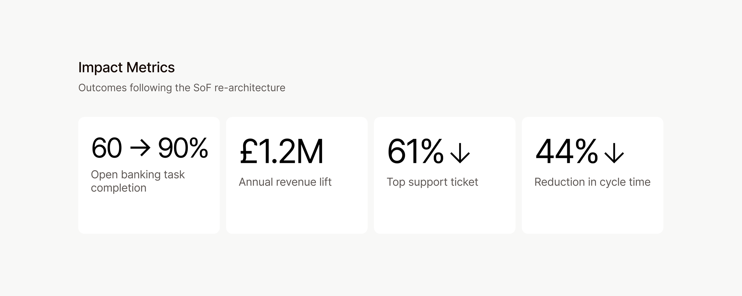
I led the redesign of the experience, from the bottom up. Top line metrics include:
130% increase in number of users successfully completing bank linking flow (key client need)
Open Banking completion rose from ~60% on legacy to ~90%.
Average linked accounts per user went from 1 to 2.3, closer to the UK adult average of 3+.
61% decrease in top issue by one design change; following update, CS team saw a massive drop-off in issues for this top query
£1.2M increase in revenue following product improvements over a 2-year period.
Reduced engineering cycle + release time by 44%
The new experience measurably improved the user experience and unlocked the ability to sell the product into new client sectors.
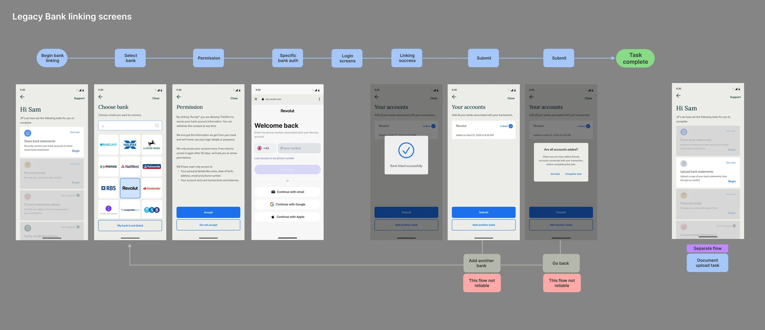
Making account linking intuitive
Solicitors need to see their clients’ financial information, to complete their due diligence: open banking is the lever that provides that snapshot view. Thirdfort uses an open banking provider to access user data, but the existing implementation was not allowing users to link multiple accounts easily - most users only linked one account– (even though the average UK adult has at least 3 accounts) which resulted in poor product performance, and extra work for solicitors who would have to chase users for manual bank statements as the fallback, then manually comb through those bank statements, adding to their workload significantly.
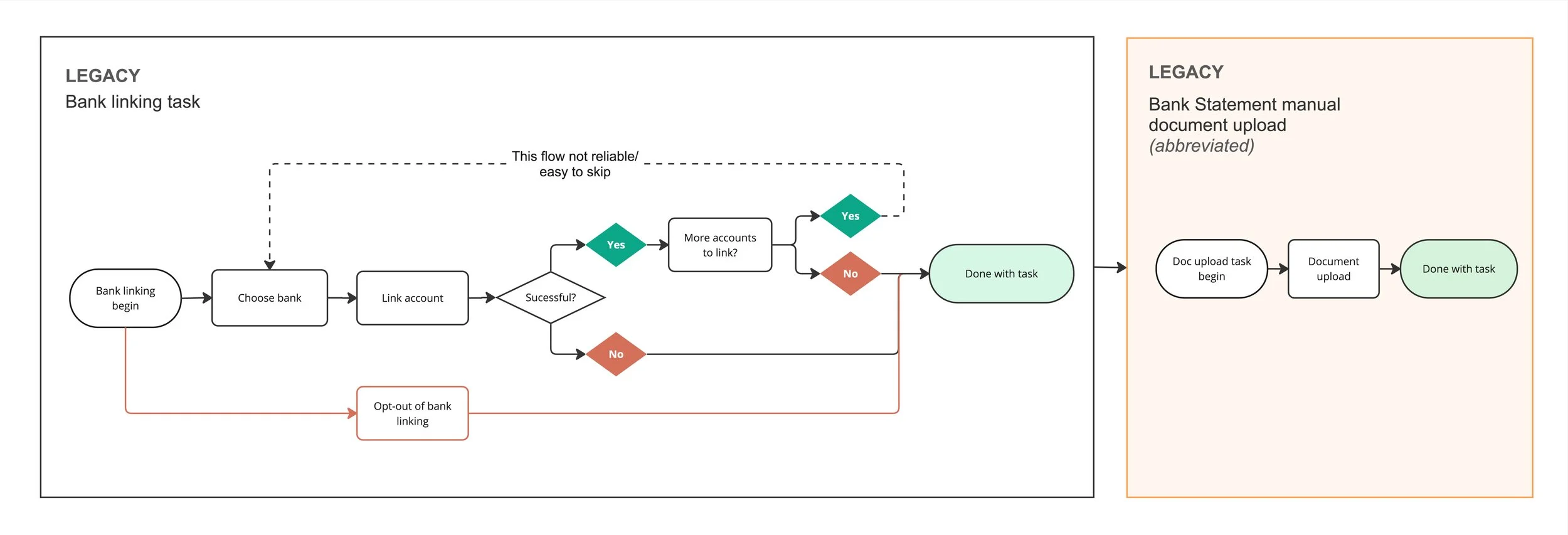
The legacy flow = 60% completion rates, and rarely more than 1 account linked.

Improved flow saw successful linking rates improve to 90%, and an average of 2.3 accounts linked/ user.
Why this matters:
Higher quality data than manual uploads: manual bank statements rely on Optical Character Recognition (OCR) technology, which can fail due to the challenges of extracting similar data from user-supplied statements. Open banking provides high quality data directly from the bank.
Smoother user journey: faster completion time, fewer drop offs, less manual back and forth, more seamless experience for clients.
Better reliability: Conveyancers get trustworthy data instantly, reducing downstream errors, and speeding up the due diligence process
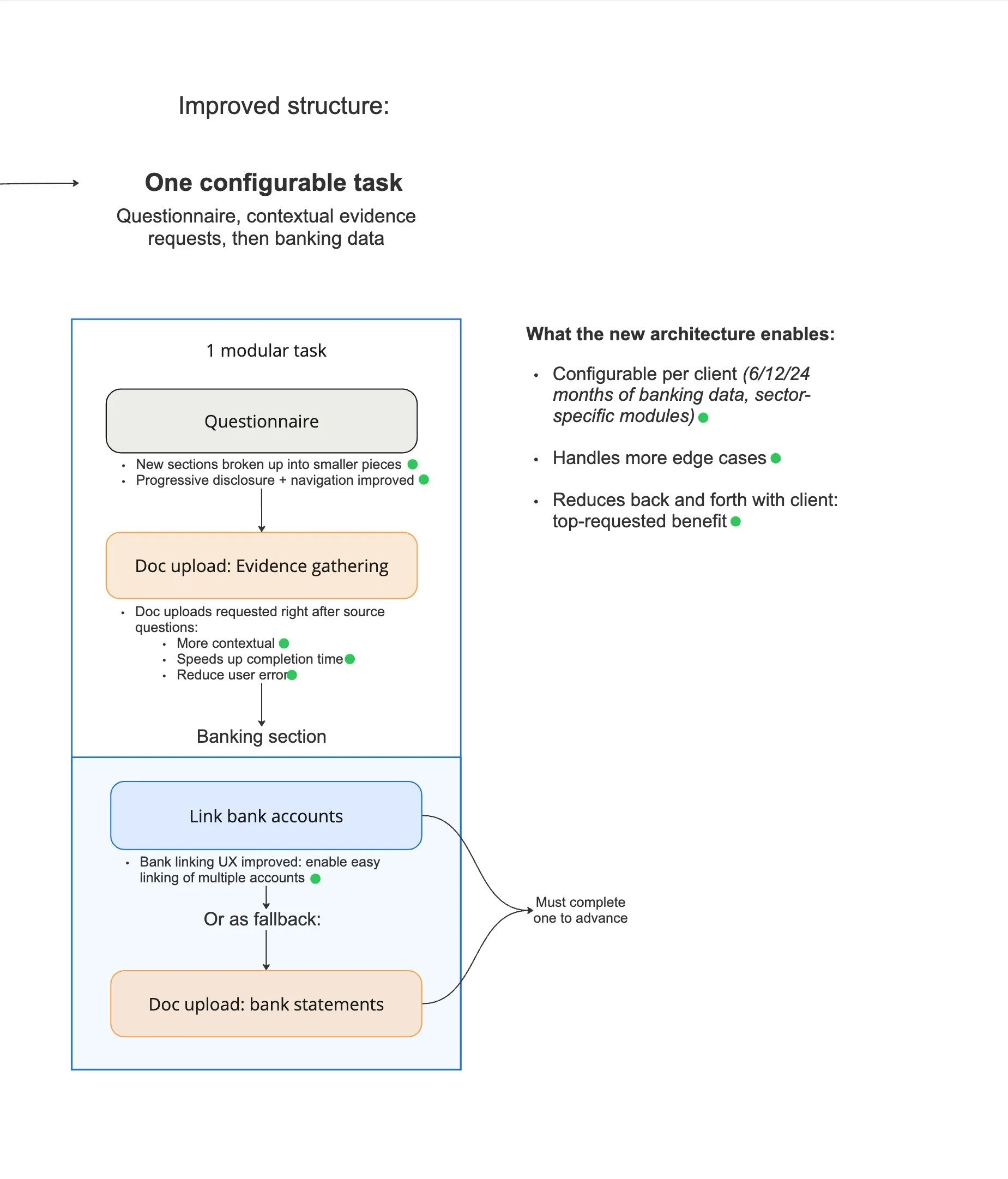
The design changes I made, broke the user journey into smaller steps, providing more instruction to help educate users what was being asked of them.
Modularity
I redesigned the task, grouping user questions in more intuitive sections, and adding an overview screen that shows progress and allows navigation between sections.
This modular approach improved the user experience, increasing completion rate and reducing support tickets around “getting stuck” issues
It also laid the foundation to enable straightforward client configuration for improvements we had in the backlog: allowing clients to select between 6 vs. 12 vs. 24 months of banking data, and add sector-specific requests as well.
Adding a status indicator to the final step cut the top support ticket (what users were stuck on)— by 61%
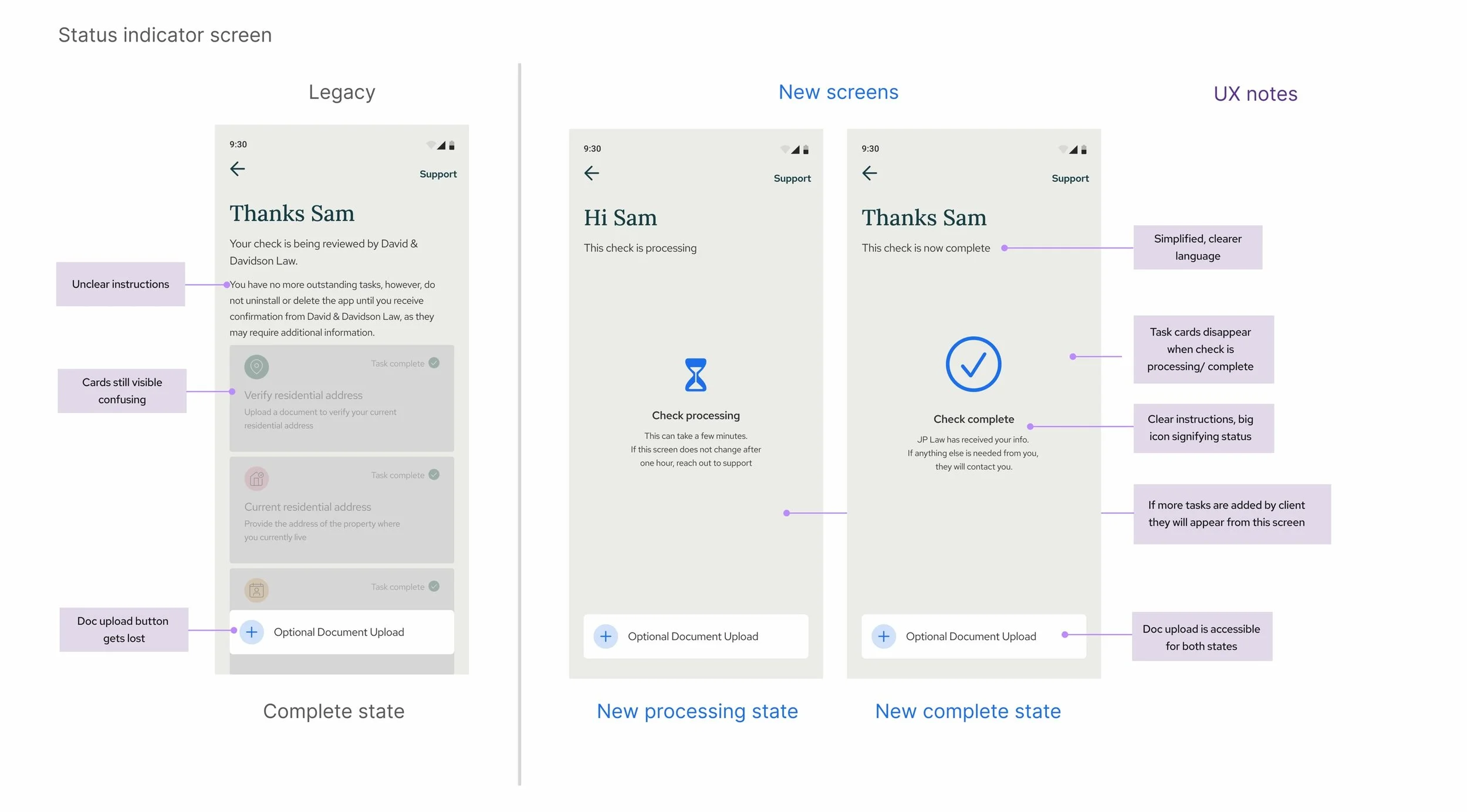
One big change: 61% reduction in issue volume after adding status indicator
I included requests for document uploads within the task: only allowing users to submit the task after they had attached all documents requested
This is the riskiest change I was most hesitant about - requiring documents to be uploaded within a task made an already long task, even longer.
The hypothesis I tested was that requests grouped by context, would improve user comprehension and success rate, and the overall length of the task was no longer an issue, since the new navigation design allowed users to save their progress and come back to the task at any point.
Repetitive modular components: pattern recognition made it easier for users to navigate, and reused code means easier for engineers to make edits.
Use of progressive disclosure streamlined the experience and reduced cognitive load: each section was broken into bite-sized pieces, allowing users to see their progress as they filled out the questionnaire, and see what was coming next.
Use of repetitive, industry best practice patterns helped build trust and confidence in the journey.
Tradeoffs
Inline document upload. Requiring documents as part of the task made an already-long task longer (the cost) but data showed users were missing how important the documents were, and pending uploads were dragging out completion times. The hypothesis: requesting documents directly after the journey mentioned them would be more intuitive and therefore more impactful than batching them at the end. It did: we have seen faster task turnaround and fewer support calls about document types.
Modular sections over an adaptive flow: It was tempting to build a single, adaptive flow, but the scope of the project was already massive: including rebuilding the backend at the same time as the frontend. Knowing this, I aligned on combining the separate tasks into one, longer task, with a straightforward component approach. My hypothesis was a longer task that is (1.) more navigable for users, and (2.) easier for engineers to work on, was a safer bet than over-perfecting a slick, adaptive flow. Such a flow could be a better user experience, but would risk incurring scope creep in an already oversized project. Given the release and how much iteration the team has already been able to roll out -including variable bank statement history- I think I made the right choice.
Reflections / what I’d do differently
When I step back from this project, one stat keeps standing out: a single loading state screen drove the largest reduction in support volume that we saw. Seeing this made me realise how biased I’ve become working on this project: too close to see how much real users rely on feedback signals like status indicators. Progress, navigation, and confirmation patterns are usually treated as polish, combined with things like edge cases and empty states, but on a project as long and valuable as Source of Funds, they can carry real weight. The next time I take on a project of this scale, I’ll treat status and feedback as core architectural decisions, rather than finishing polish.