
Source of funds
re-architecture
Thirdfort - Product Design - SaaS - 2024→2025
Your transaction details and supporting paperwork, details about the sources you’re using for this transaction, such as mortgage information and documents.
It is a legal requirement for the company requesting your information to gather this information, and doing so helps prevent fraud and money laundering by breaking down how this transaction is funded. Read more about source of funds.
1/8
Frame + headline results + my role
Source of Funds is one of Thirdfort's core products. It's sold to solicitors and estate agents, who use it to confirm a client really has the money in place before buying a home. So there are two customers: the firm who pays for it and configures it, and the person filling it out on their phone.
Headline results:
Bank linking flow completion rate increased 60% → 90%
Education tickets dropped from ~70 /month to ~10
2.1x Annual Revenue Retention from repeat clients, following updates
My role: Lead designer, owning the journey shape end to end, testing & defending decisions before we built
The team: PM, Compliance expert, FE & BE engineers (4 total)
2/8
Problem + success criteria
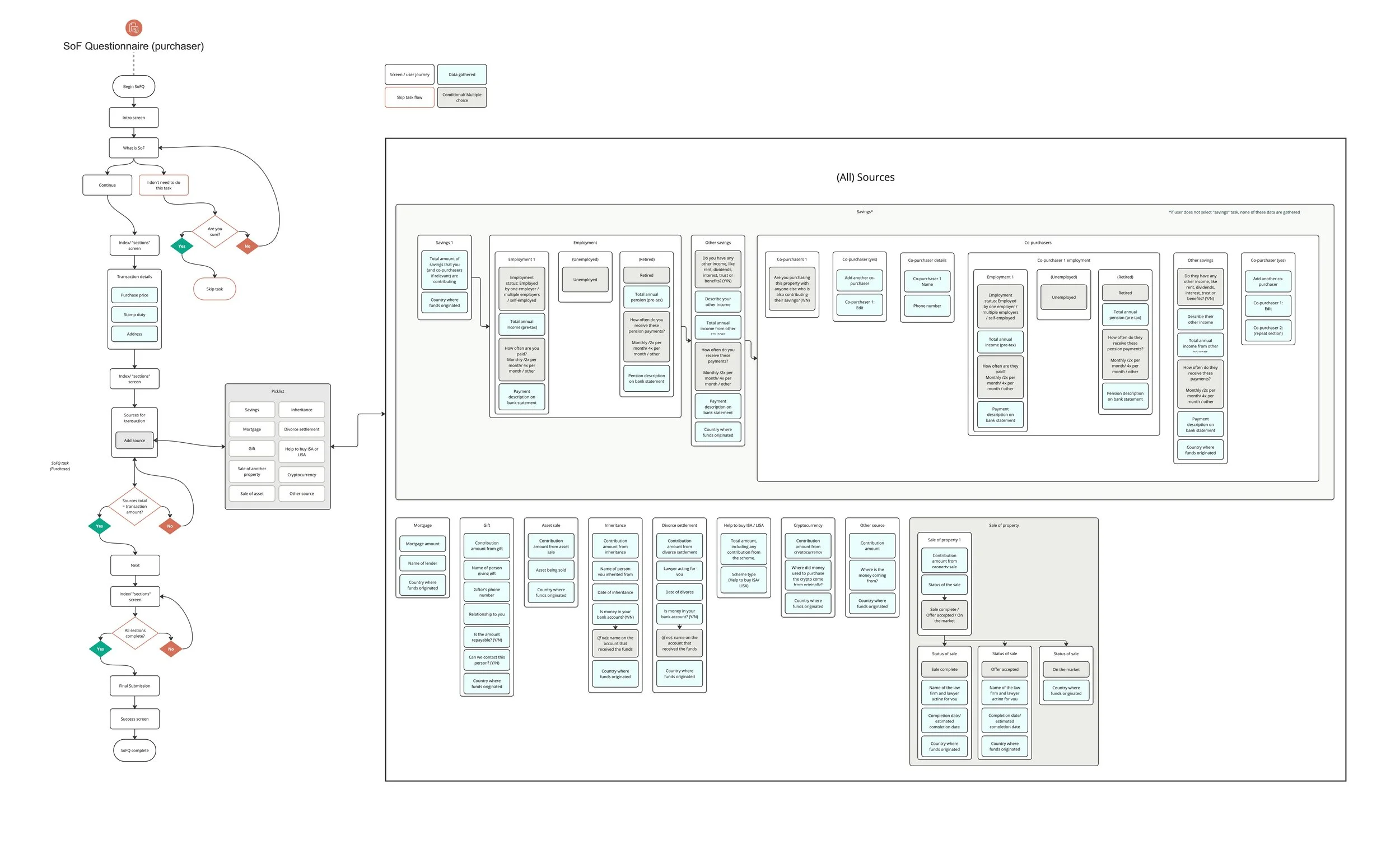
(The before) legacy journey map:
The legacy version was one long form, no progress indicator, redundant questions, and uploads as separate tasks. It was one of the biggest drains on our support team, with around 70 'education' tickets a month: people asking what documents were needed, or why they had to do this at all. Missing evidence meant firms chasing clients, which delayed transactions. Some clients told us they'd stopped using the product because it wasn't fit for purpose.
I set four success criteria up front:
Fewer education tickets, as a proxy for 'is this intuitive'. The baseline was about 70 a month.
Higher completion: at least 10 points up from the high 70s.
Evidence attached the first time.
We didn't track this directly, so linking and upload completion are our proxy.
Better data for clients: open banking data instead of chasing statements.
3/8
Talking to customers,
And the bet

“It seems quite a faff.”
-Compliance lead
Estate agency

“I get a lot of the team is
saying, “it’s taking too long”… your solution is a bit hotch-potch…”
-Senior leader,
Estate agency
Two signals pointed the same way. Clients told us it was broken, and support ticket data told us where. People weren't confused by the questions. They were getting lost in how the task was structured, and every time they left to find a document, a percentage of them never came back.
That gave me the idea the whole redesign is built on: Never break the loop. Here's what you'll need and why, do you have it, capture it now in context. One repeating pattern. That's why this was a rebuild of the structure, not a UI refresh.
4/8
The scope call: one card, five states, configurable
Before I show you the flow, this is the scope call that shaped it. A single adaptive flow, where the questions change based on your answers, was the tempting option. The project was already oversized, so I chose not to add branching logic on top of a new backend.
So I designed one card component with five clear states: begin, next up, in progress, done and resolve. Users learn the pattern once. Engineers reuse the same code. Intuitive, reusable, quick to build.
What the firm configures vs. what the consumer sees
That structure is also what makes the product configurable for the firm. Every section is a card, so a new option means configuring a card, not building a new flow.
The firm chooses how much bank statement history it needs: 3, 6, 12 or 18 months. The consumer only sees an accounts section that asks for that much.
We have since shipped configurable bank statement history on top of this structure. That was the scaling goal.
6/8
Bank linking,
a decision I changed my mind on
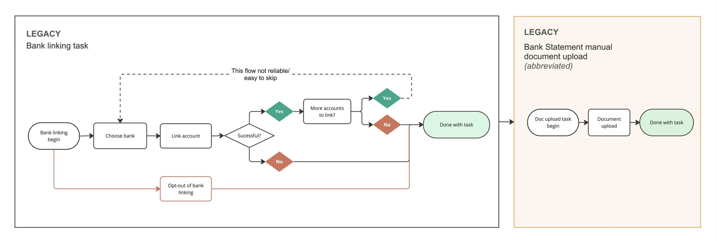
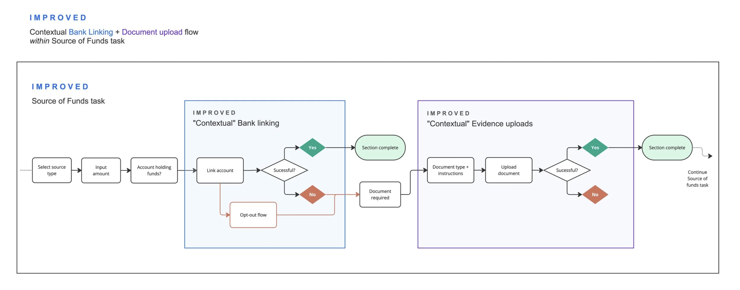
Bank linking uses the same loop: straight after you tell us about your accounts, you get the option to link.
I was originally convinced bank linking should stay a separate task, because when linking fails it falls back to manual statement uploads, and I worried that would make the main journey messy. But when we looked at where people actually got stuck, it wasn't the technology; it was not understanding why they needed to link. So we moved it inside the task and added that context.
Successful linking went from ~ 60% to ~90%, and linked accounts per person went from 1 to 2.3.
7/8
Results
Impact Metrics
Outcomes following the SoF re-architecture
Going back to the four criteria:
Education tickets: from about 70 a month to under 10, roughly 85% down.
Completion: high 70s→mid 80%
Evidence first time: tracked via linking and upload completion (see above)
Better data for clients: bank linking from 60% to 90% means firms get open banking data instead of chasing statements.
After launch, one change, adding a status indicator to the final step, cut our top support ticket by 61%. On the business side, existing SoF clients now spend over two times what they did two years ago, before this update. Engineering cycle time is also way down.
8/8
What I'd do differently next time
The honest insight: this is a long task, and we made it longer. Someone will always get stuck. The main SoF ticket now is people wanting reassurance that they're filling it out correctly. So next time I'd design for the stall itself: detect when someone's been idle too long and reach out with help, rather than waiting for them to contact support. That's cheap to test: one signal, one intervention, measured against a holdout group.
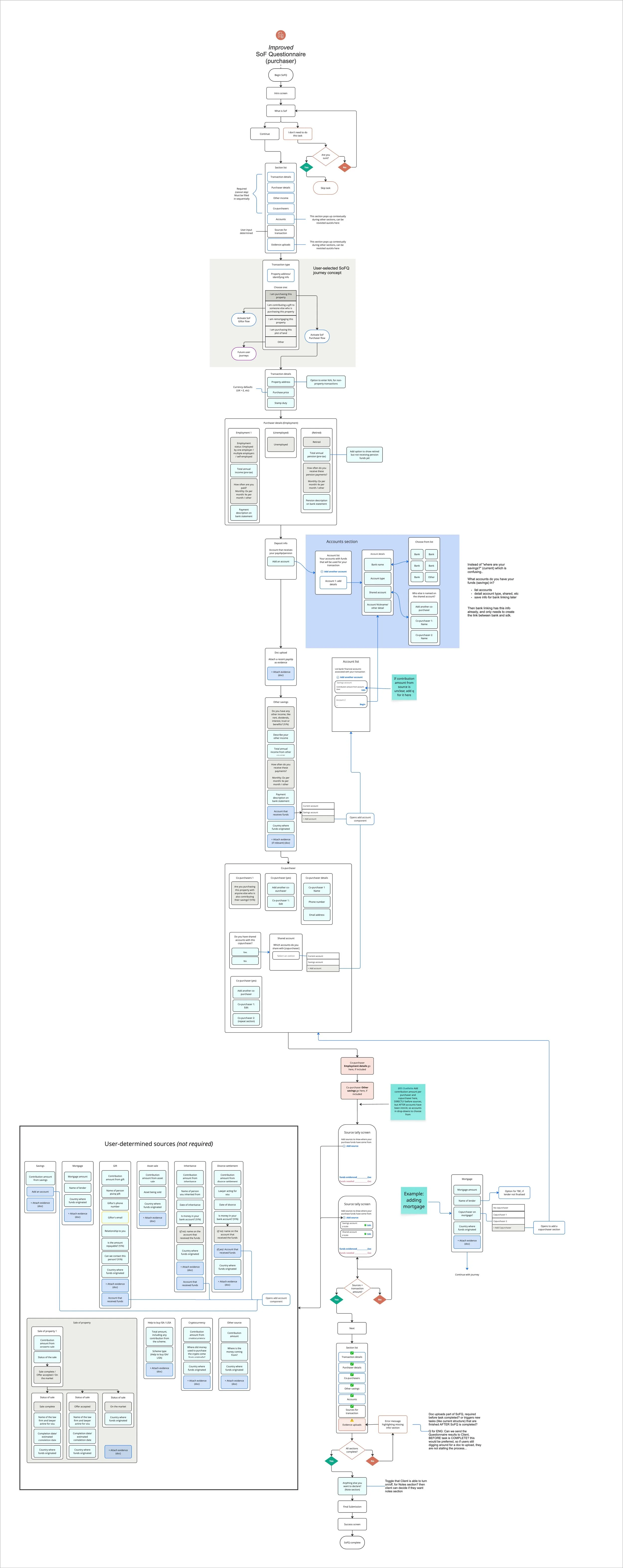
(the after)
Improved journey map
5/8
The loop, walked once: mortgage
You’ll need to share details about your mortgage and provide evidence of your mortgage offer to complete this section:
In order to complete your source of funds check, we need to confirm your mortgage is in place. If you do not have a confirmed mortgage (or at least a mortgage in principle) your transaction may be delayed.
details saved
Here's one source walked end to end.
The index screen shows every section and your progress. The legacy task had nothing like this.
Before each section, a 'why I need to do this' screen tells you what to have ready. You can pause or back out, go and find your mortgage agreement, and come back.
Then the inputs, and then the upload, right there. Previously the upload was a separate task, which is where users lost the context of why they were uploading it, losing momentum.
This was the riskiest decision in the project. It made a long task even longer, and honestly it was a hunch. I held it loosely: we rolled it out in phases to selected clients, so we could roll it back if completion dropped. It didn't drop; document and linking completion went up. The lesson was that people see this as one session. They'd rather set the phone down, find the paperwork and finish, than leave and come back. Some older users would call support and ask the agent to stay on the line until they'd finished the whole task.