
Product Design:
Thirdfort - Mobile App Rebuild + Redesign - 2022→2024
TL;DR
Led ground-up rebuild of Thirdfort's consumer ID verification app (iOS + Android) over two years: the customer-facing surface of a B2B2C business where the app experience is the product. Partnered with PM, engineering, and compliance SME to ship new UI system, restructure the underlying code, and improve UX in the highest-friction journeys. Improved chatbot containment, £78K/ month revenue lift, and reduction of cycle + release time by 34%.
.
Brand surfaces
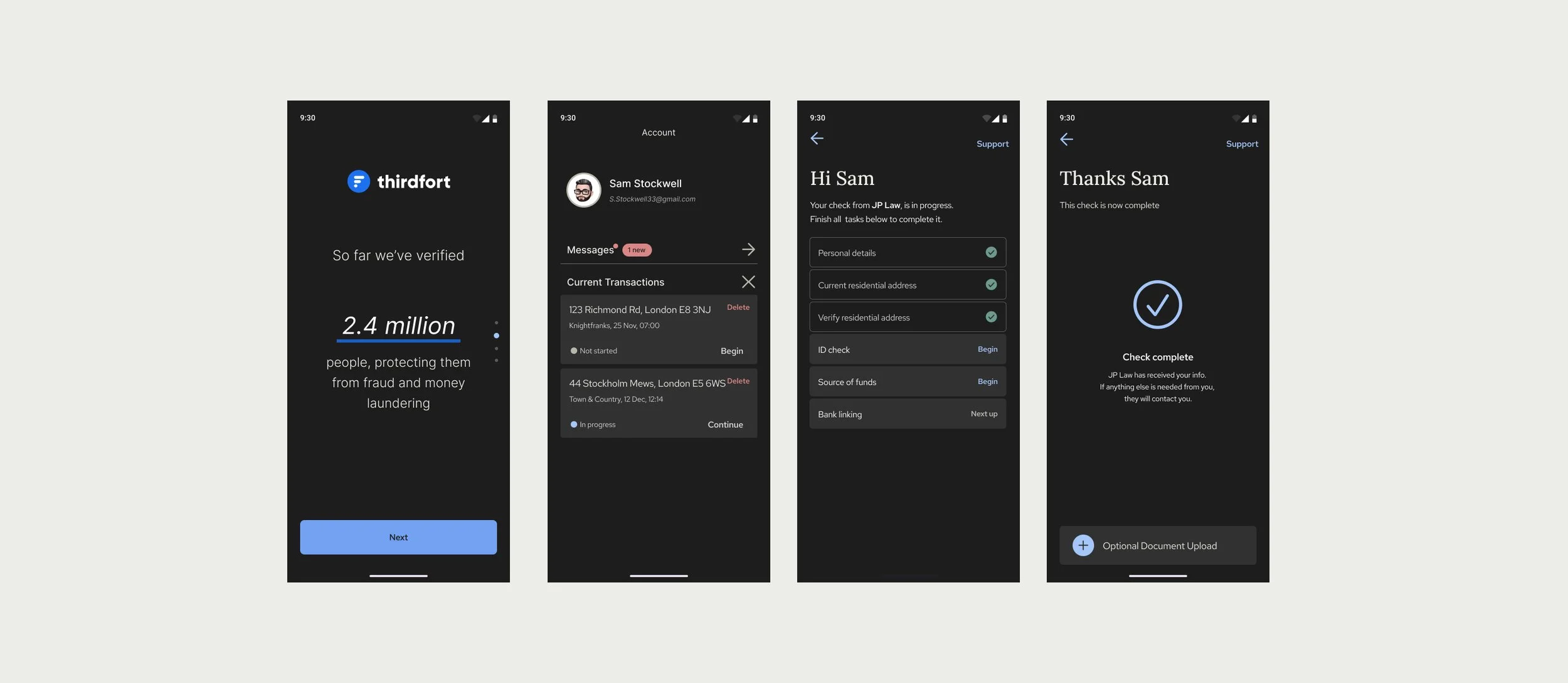
iOS + Android consumer apps for Thirdfort (used by legal and financial firms running ID/AML verification on their clients).
.
Company background
Thirdfort is an ID verification provider that partners with financial and legal companies to provide background checks on individuals and companies.
Project Overview
When I joined Thirdfort, I was tasked with redesigning the consumer app (for iOS and Android) from the ground up. The project took almost 2 years of iterating, designing, and collaborating with frontend and backend engineers, product managers, and key stakeholders. As a B2B2C business model, Thirdfort’s entire business depends on the user experience of the app.
Media
Product design for mobile app, UI screens, UX strategy + implementation, user flows, user research, key metric
Team
Led design as the sole IC. Partnered with 1 PM, 1 EM, 4 frontend engineers (2 iOS / 2 Android), 2 backend engineers.
Outcomes
Improved chatbot containment, Monthly revenue +£78K, reduced cycle time by 34%
Process:
How I approached each stage of the project
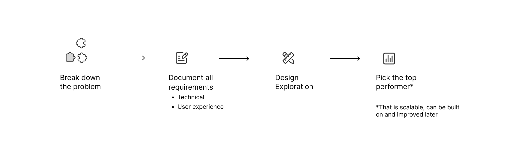
This project had many stages, three of which I will highlight:
UX improvements
UI redesign
Continuous Feedback & improvements
Focus 1: UX improvements
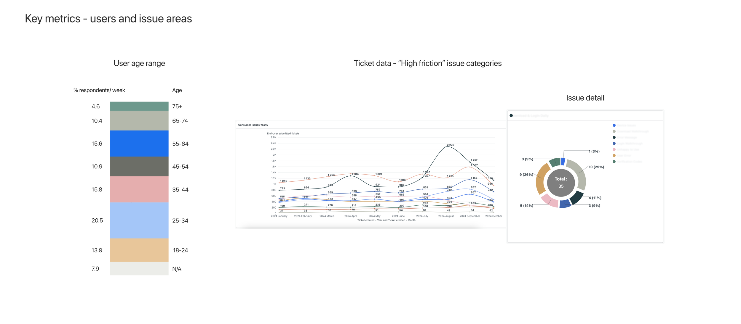
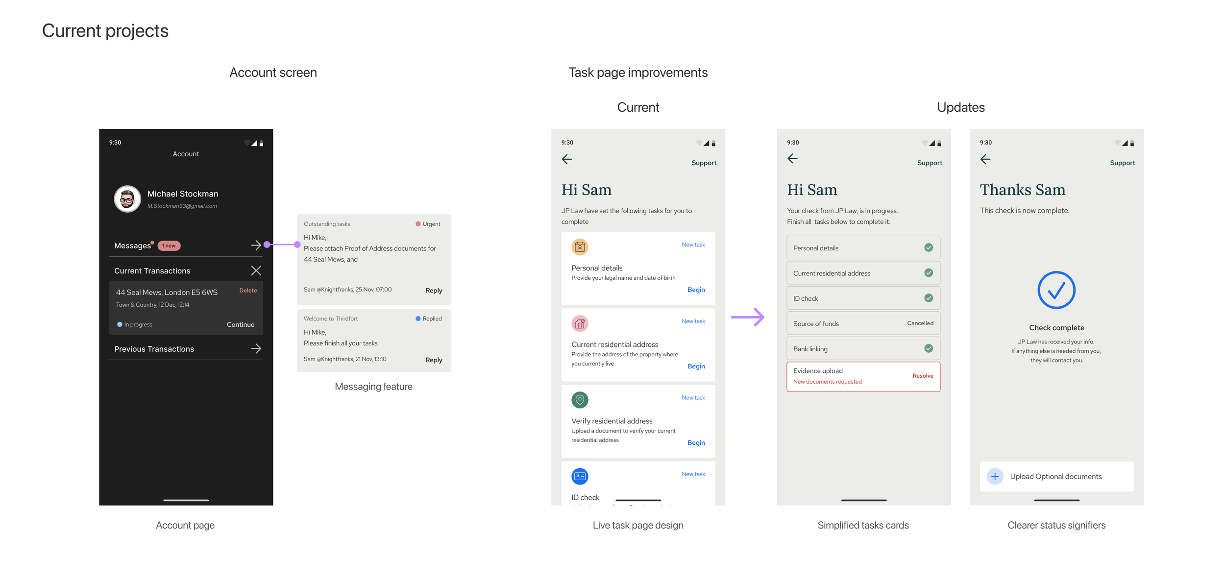
The redesign incorporated a complete rebuild of the code structuring the apps. A meaningful share of the work was code and pattern refactor: unglamorous, but necessary before any meaningful UX improvements could land. We had enough feedback based on data from customer support ticket volume and app analytics, to identify weak points in the user experience, which I worked to improve.
One example of this, was improving the way users are able to contact support within the app. Previously, the contact support buttons were hidden behind a hamburger menu, and the customer support team was struggling with the volume of calls coming in, since users vastly preferred voice calls to email or chat.

I simplified the navigation by making support a one-touch button at the top of the page on key screens where users would most likely need help, like the Task home page. Tapping the “support” button instantly opens a new screen, automatically starting a conversation with the chatbot.
Firstly, this reduced call volumes, since the chatbot is set up with basic intelligence (pre-loaded responses) to help users self-solve common issues. Secondly, it multiplied the effectiveness of the support team, by allowing them to handle multiple user tickets at the same time. One agent can handle up to three messenger chats simultaneously, compared with only one call at a time.
Focus 2: UI redesign
I brought in industry standards and best practices for updating the app UI design. The branding team had recently completed a branding refresh when I joined, so I took their modules and reinterpreted them into mobile platform friendly components.
Much of this work was graphic in nature, bringing the app up to speed with competitors, as well as considering user interaction patterns, to align interactions with expected behaviours that were intuitive, discoverable, and in tune with existing iOS and Android patterns.
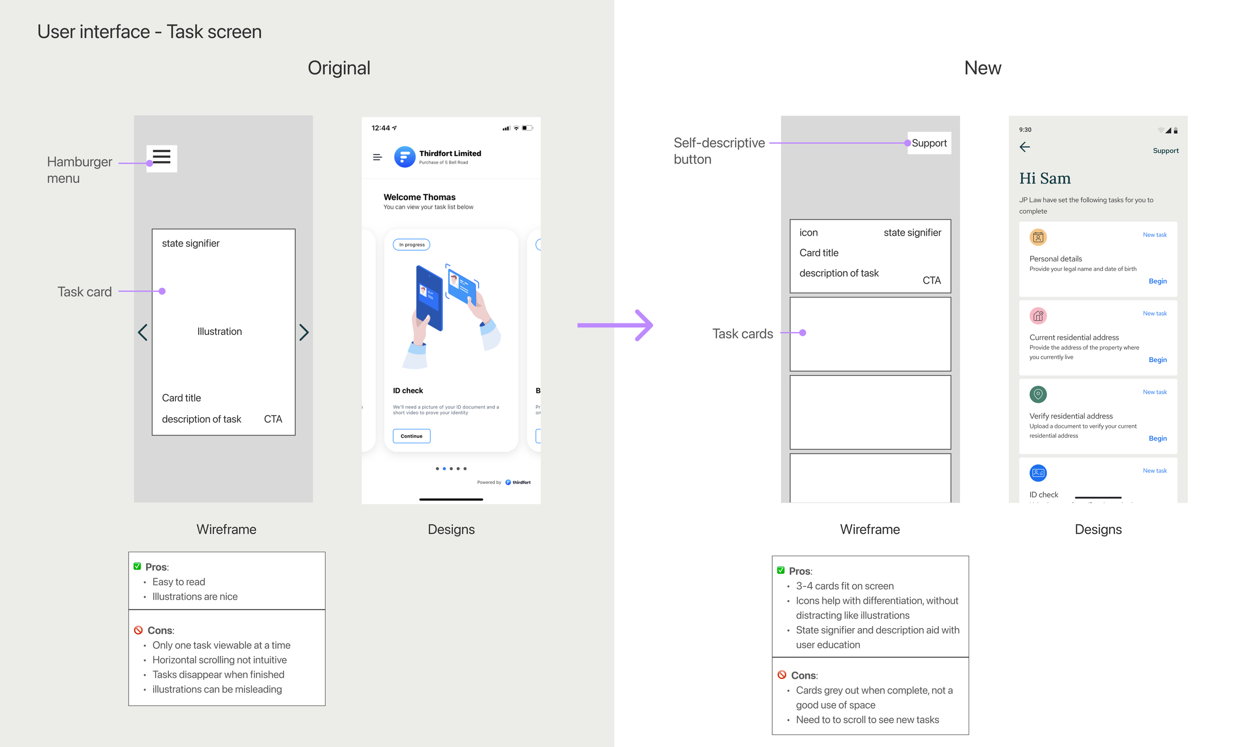
Above is one such example: simplifying the home page to allow more space for task cards, reducing visual clutter, resulting in a lighter, more modern interface
Results
Since launching the update, we have seen a 4–15% increase in total number of users coming to support through the chatbot (Original designs; 24–25%, updated designs; between 28–40% of total users).
This percentage has a meaningful impact on customer support workload, since the chatbot handles between 80–85% of total user issues that come through; meaning only 15-20% of users coming through the chatbot require human agent interaction to resolve.
Focus 3: Continuous feedback & improvements
Since launching the app redesign and the newly available data from app analytics, cross-referenced with user support ticket themes, the product team has entered a period of continuous product improvement. We have planned updates to improve known user “friction areas” in the app, and have been balancing these with new product features.
Creating an intuitive user experience for all of our users has been the challenge with this project, but the result was a clear lesson: common UI patterns outperform custom ones for inclusive design, every time.
I have focused on reducing interactions down to their most elemental form, never sacrificing clarity for style (for example, choosing buttons that say “edit” rather than icons that may be misunderstood), and the result: 90+ year old users successfully completing our app journey.
Reflections
Operating-model: If I started this project again today, I wouldn’t touch a design tool until I had mapped out all the user journeys, pain points, and opportunities for improvements. Only then would I start mocking up design possibilities. I learned midway through the project that getting alignment on goals and agreeing on success metrics is the foundation that design work is built on. There was enough low-hanging fruit with this project that I had a backlog of improvements to ship. That being said—do it over again—I would have involved our SME and senior engineering staff earlier on, so they could help design the shape of the data-handling system, to save us doing so mid-flight later on. Rewriting an API mid-flight isn’t something I’d recommend twice.
Crafting for a wide audience: Designing for an audience that includes 90-year-olds taught me that interface conventions are accessibility decisions in disguise. A CTA labled 'edit' outperforms an edit icon at every age: younger users lose nothing, and older users gain access.
Influencing org-level change: as an IC, especially one new to the company (and country) it can feel like asking for permission is necessary before making a big change to the way things are done. When we made the switch to Figma, it was far overdue—teaching me that asking for forgiveness can be the best path to adoption—just frame it as “an experiment.”
Beyond the redesign - related projects
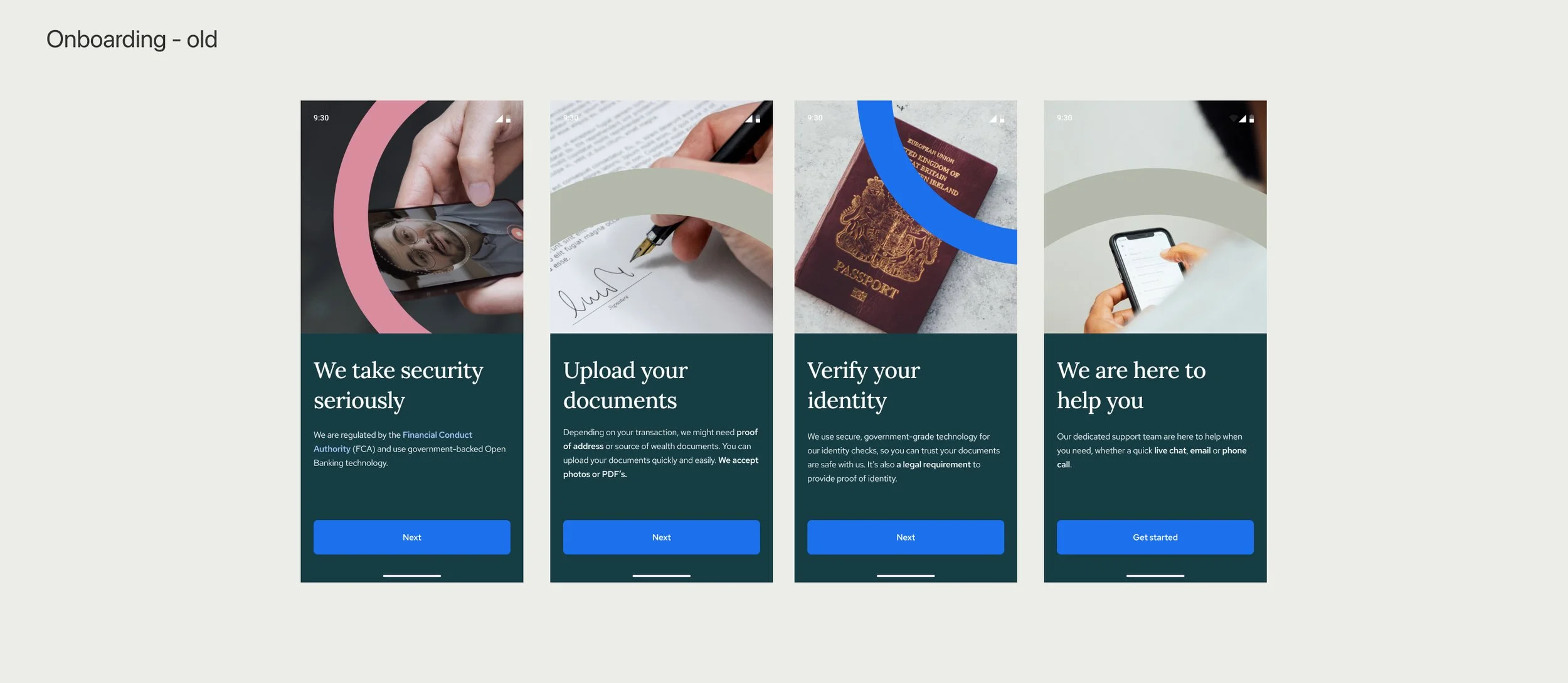
Improving onboarding experience
Communications with users (in-app and otherwise)
Making Task screen even more intuitive, based on user feedback
Evolving the concept of a user to incorporate profile/ account
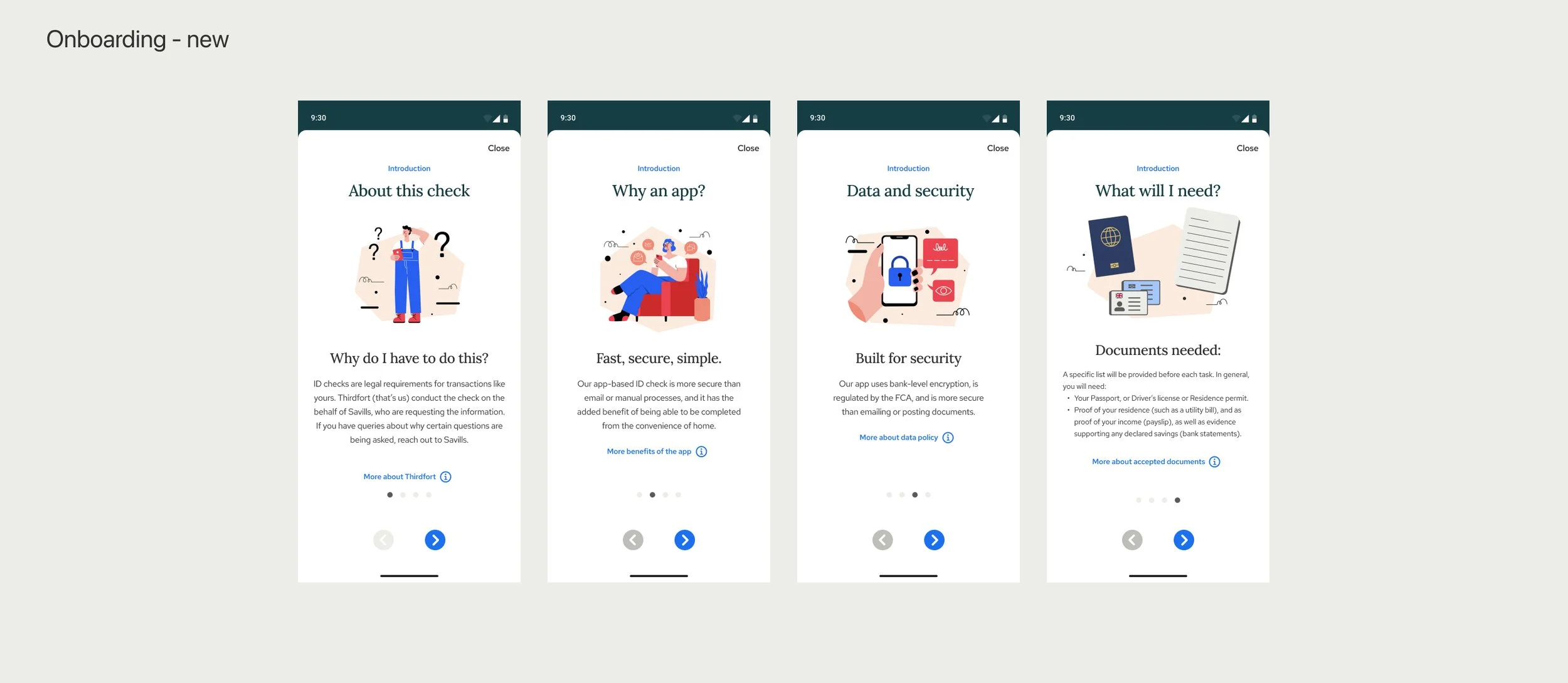
Updated styling for onboarding screens. These screens must explain complex topics, while still being approachable, snackable, and easy to understand.
Consumer Communications Strategy development
After doing a deep dive on user issues, I formed the hypothesis that many of the issues users were facing was due to a lack of information, which we could provide by improving the user experience in the area of communication (messaging + channels) that Thirdfort has with users. This hypothesis has resulted in a handful of product improvements.
Design tooling implementation
When I joined the team, the leadership determining ways of working, was effectively using a waterfall approach. I was an early proponent of more collaborative ways of working, so after trialling Figma, we adopted the tool for the entire consumer experience team, which helped by:
Providing a single source of truth for all team members
Enabling engineers to see design work in progress, facilitating collaboration
Providing the customer support team a dynamically updated map of user flows, reducing duplicative work (they previously had created their own)
More updates
Improvement of product documentation and design system implementation.
Working with marketing to improve known issue areas with automated GIFs and videos that the chatbot can serve up, without needing an agent.
Supporting other teams, like our client-facing teams, for design needs.